Tomark Industries
One-Page Website That Packs a Big Punch
We are so pleased with our new website. Thanks for all your hard work!
Visit: tomarkindustriesinc.com
We are so pleased with our new website. Thanks for all your hard work!
Visit: tomarkindustriesinc.com
This case study analyzes work completed in 2018.
Tomark came to Bright Orange Thread wanting a validation website to talk about the benefits of the Viton product line and to urge prospects to learn more about how it works.
Since Tomark had a clear objective, we decided that the best choice going forward would be to build a one-page site.
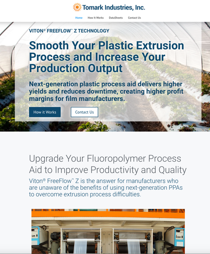
To start, we created a hero tile that gets right to the point of their value proposition. In this opening message, Tomark displays the benefit of Viton technology to a prospect's bottom line: increased production output and higher profit margins.
This clear and simple message aims to entice the visitor to scroll down for evidence to support these claims.
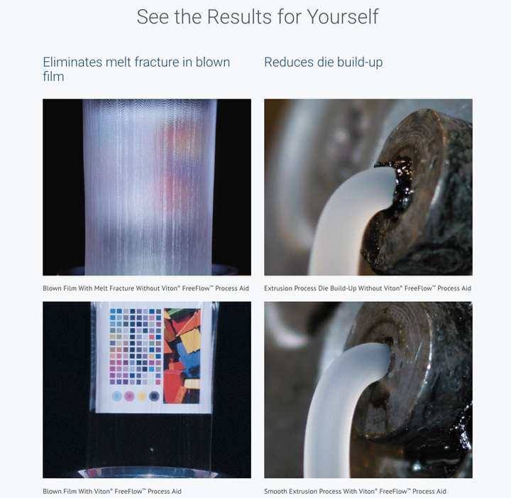
This section contains clear examples supporting the value proposition that Viton “smooths [the plastic] extrusion process."
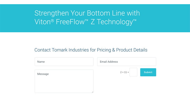
This call-to-action at the end of the page urges prospects to get in touch for more details. They are prompted to contact Tomark via email right on the homepage.
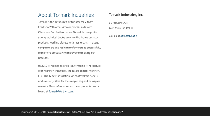
A short “About” section clarifies more information about the company and provides critical contact info, such as the physical address and phone number.
Like a sales pitch, the Tomark website presents the prospect with a point-by-point case why Tomark’s product is the answer to their manufacturing needs. It wraps up with a call-to-action for the prospect to contact a distributor for pricing details.
Tomark's website is clean, cohesive, and was quick to launch.
In this situation, building a one-page site was the most logical choice as it keeps the prospect's attention with its simple message without requiring them to leave the site for further information.
By getting right to the point and avoiding any fluff, the site is effective in passing the 5 Second Test and makes turning visitors into clients far more likely!