Our Blog: Bright Ideas & Strategies for Improving Business Websites
2018 Called...they want their website back
What it means to look “current” on the web is constantly changing.
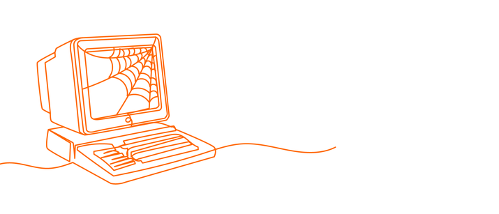
A homepage that looked sleek and modern 5 years ago now looks completely out-of-date.
Prospects will move on to your competition’s website, and your bottom line will suffer.
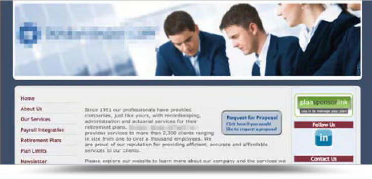
Today, Times New Roman font, stock photos, and dated layouts are a major turn-off.
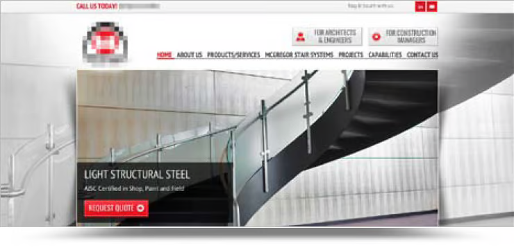
Modern design will reaffirm your credibility and make users want to keep reading.
For insight into what’s popular and what’s not in the design world, check out these blog posts:
- Video Backgrounds - when NOT to use them
- Why Stock Photography is Bad
- You Have 5 Seconds to Show Your Relevance
- Speaking Navigation - why you should use it
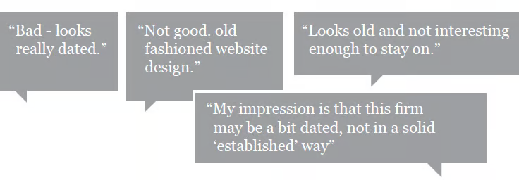
Your users have taste.
They visit dozens of websites a day. They know the difference between a current design and a dated one.
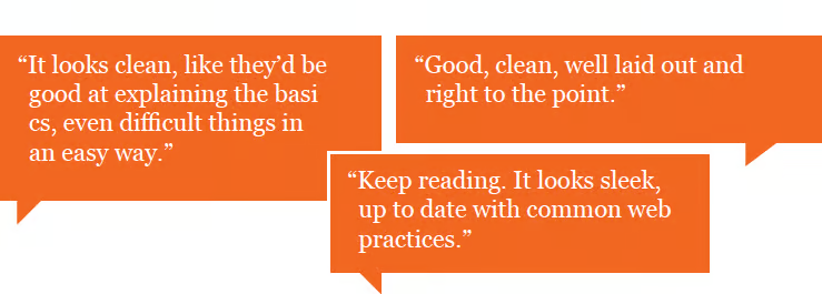
Keep a pulse on the newest design trends.
You don't have to jump on every new trend—there's nothing worse than a site using every modern design feature in the wrong way.
But you can stay relevant by keeping an eye on changes in website design and updating your site where it’s appropriate.
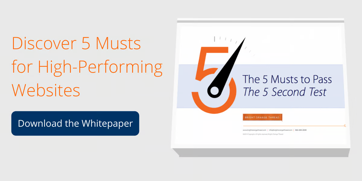
Insight on where to start updating your site.
You know prospects are making judgments about your site based on the design, but what aspects are good and which are bad?
Identify where your website is falling short with 5 musts for high-performing websites.
ƒ
Be a Bright Marketer
Improve your family-owned business's marketing strategy with resources, tips, and insights delivered to your inbox 1-2 times per week.
Subscribe to the Bright Orange Thread Content Library today for instant access to these resources!