5 Landing Page Mistakes that Hurt Conversion
Landing pages are about one thing: Conversion.
Their purpose is to convert visitors who have ‘landed’ on the page to do something… download a white paper, register for a webinar or event, purchase a product, as well as hand over some personal information in the process.
It’s a tall order, which is why many businesses seek out Landing Page Optimization (LPO) to maximize their landing page conversion rates.
Through our own LPO work with clients, we’ve noticed a few areas where landing pages usually fall short. So you can avoid them, we’ve compiled a list of 5 common landing page mistakes that will hurt your conversion rates…
Poor headline
Great landing page copy is half-headline and
half-everything-else!
The headline needs to be the strongest message on a landing page, so plan on spending 50% of your time or more writing it.
Your headline is responsible for helping visitors connect the dots between the place they came from, like an email, a Google search, or an online Ad, and where they landed (your page). They must be constantly encouraged to keep reading.
Make sure the ‘call-to-action’ is present and clear in the headline, as well as the benefit that touches on your visitor’s ‘painpoints.’ And to ensure that visitors don’t skip over this benefit, front-load your headline by placing valuable keywords in the first few words!
Including other content that competes for visitors’ attention
Can you easily spot the call-to-action on this page?
The most effective landing pages focus on a single offering.
The last thing you want to do is compete with yourself. And that’s exactly what you’re doing when you put multiple offerings on the same landing page.
The user’s train of thought is sacred.
If you give visitors too many choices, they won’t be sure of what they’re supposed to look at or click on.
Every little extra thing you add will chip away at their focus.
An effective landing page focuses on one product or service at a time, or sometimes a very small amount of similar products. Landing pages with a single focus will always outperform. (Even if there is only one ‘call-to-action’ button or link, make sure it’s ‘large and in charge’ for maximum visibility.)
Using same design as your main website
Instead, create a ‘watered down’ landing page design to increase conversion.
What’s wrong with this practice? Same reasoning as Mistake #2, your main site has navigation links and other elements that could distract visitors from the task at hand.
Perhaps a visitor notices the ‘About Us’ link at the top and leaves the page to find more information. This could set off a domino effect, jumping from page to page until there’s no easy way to get back to the landing page (or they completely forget and don’t care to return).
Take a page from our book!
Our landing pages include our site’s navigation, but we place it low in the footer so it’s not competing with the ‘call-to-action.’
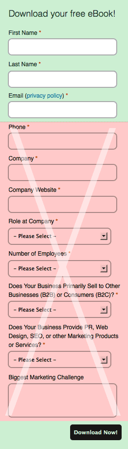
Only ask for the most critical information!
Form process is too long
Nothing turns away a visitor faster than 15 required form fields.
If the ‘call-to-action’ for your landing page is filling out a lead capture form, make it short and easy for users. This is no time to be greedy! Only ask for the most critical personal information, like an email address and name.
Remember: The benefit you are offering must outweigh the perceived cost (effort, risk of providing personal contact information to a strange company).
Lack of testing
There’s no excuse for not testing! The whole process should only take 1 minute of your time (any longer and your visitors will leave).
If you don’t go through the lead capture process yourself, how will you know if everything is working properly? In fact, there are a number of things that could go wrong:
- Form submission didn’t go through
- User never received a confirmation email
- The white paper didn’t download
Test your lead capture process so users don't have to tell you something doesn't work!
Leverage Analytics for Better Testing
A/B Testing is a good idea if you’re looking to improve a landing page but you’re not quite sure what needs improvement. That’s where reviewing your site’s analytics can help you.
For example, maybe you’ve noticed that a ton of traffic is landing on your page, but the average time spent on page is 8 seconds. This stat may indicate that something isn’t working for visitors right off the bat–maybe the headline isn’t strong enough or maybe they see the form and don’t want to bother.
You can test these things by creating a second landing page with the same content and offering, but change a single variable like the headline or the length of your lead capture form. Then compare the analytics of the 2 pages, as well as any differences in conversion rates.
You’re now a landing page expert!
Well, not quite. As you can see, effective LPO addresses a ton of different aspects, including design, information architecture, copywriting, your overall marketing strategy, as well as aspects we didn’t cover like SEO and keyword research.
That’s a lot to nail down, so don’t hesitate to get a second opinion on the effectiveness of your landing pages. If you don’t know where to begin, drop us a line at info@brightorangethread.com and we’ll get you started!