
Our Blog: Bright Ideas & Strategies for Improving Business Websites
Blogging Best Practices: Calls to Action that Convert
You want more than high traffic on your website, you want conversions. Placing offers on your pages and posts helps you guide visitors through their buyer’s journey.
Your blog posts help prospective buyers learn more about their problems. By offering free insight into their pain points, you’re helping them identify what headaches they need fixed. But when people finish reading, they shouldn’t feel finished with your content.
Cue the Call to Action.
BTW, if you happen to like the offer in this CTA, click on it. While it has nothing to do with the blog post and violates a best practice we give you below, we did take the time to link to our offer, just in case.
Convert blog visitors to leads with helpful CTAs
Adding Calls to Actions (CTAs) to your post is a blogging best practice because it offers readers a next step. One click gives them a way to dive deeper into their problem with a new piece of information. This is good for you because they’ll continue to engage with your content. Whether it’s downloading a white paper, watching a video, or signing up for a newsletter, CTAs are the key to turning anonymous blog visits into conversions.
Content writers beware: careless CTA’s scare off potential leads
Keep in mind, it’s easy to make CTAs distracting or discouraging to the reader. You want their full attention, but adding a full page pop-up that blocks the screen after a few seconds is overkill.
You also want to make sure the CTA makes sense for the blog article. It should be a logical next step.
For example, you’re reading about CTAs and how they convert visitors into leads. If we offered you a 60-minute webinar at the bottom of the page that detailed how our different digital marketing services increase your conversions, you’d brush it off. That would be a big ask for someone who read one blog post that merely scratches the surface of their potential problem. It would be more natural to offer you a whitepaper you could download for free about CTA designs that attract clicks.
Remember, CTAs need to match content contextually to move users through the buyer’s journey. Here are some examples of CTAs that fit content at each stage:
Awareness Stage Blog Post → Sign up for eNewsletter or Related Awareness Stage Whitepaper
Consideration Stage Whitepaper → Decision Stage Webinar
Decision Stage Webinar → Paid Service Landing Page
If you need help mapping out your content funnel, here is a tool you can use.
Test out These 4 Types CTAs in Your Blog Posts
As a blogging best practice, you should insert 1-2 CTAs per post. Any more will be overwhelming. Remember, the CTA must fit with the context and appeal to the same persona.
Subtle interrupter CTA
Interrupting a blog post or web page with a subtle CTA can guide users to a new page. After a few paragraphs, include a short sentence that links to a related post, your contact form, or even a landing page offer (Did you notice the one we used above?).
P.S. at the end
The postscript is a powerful final thought that has been proven to get clicks and generate leads. This personal touch dates back to the old days of handwritten letters - share one final nugget that gives your CTA a kick.
Pop-up or slide-in CTAs
Pop-ups walk right up and ask for the offer. Love them or hate them, they work. Choose a pop-up that triggers after the user scrolls through a page or spends too much time on your site to not get an offer, and put in the extra time to stylize and animate the CTA. No one wants a gaudy pop-up intruding their visit to your site: make it slide in smooth, make the text say “hello”, and make it too irresistible to close out.
An example of a slider CTA on Pegasus Technologies' homepage.
Sidebar or bottom placement
You can also place the CTA at the end of the blog post or in the sidebar. There is no single right answer or secret to CTA placement that converts without fail. You should test where you place your CTAs and zone in on the click-through-rate hotspots.
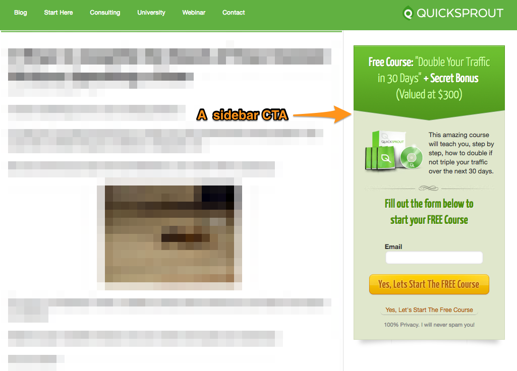
Quicksprout’s sidebar CTA in one of their blog posts:
A Hubspot CTA placed at the bottom of a blog post:

Stylize CTAs for important offers
Don’t ruin your Call to Action with an ugly hyperlink. Make an offer eye-catching. A well-stylized link or button looks more like a welcome mat for a cursor.
Impact pulls this off well for their inbound marketing eBook, which also interrupts their archive of blog content:

One Page Exercise: Add CTAs to Your Blog Posts
Try SumoMe. SumoMe is a great tool for adding pop-up and slide-in CTAs to your website. You won’t have to change your page layout or ever open Photoshop. SumoMe doesn’t need a fancy image, just good copy.
Set up the offer and landing page, grab a headline from your landing page, and you’re ready to go. It will give you a line of code to embed in your site. Once you paste in the code, your CTAs will start engaging your web traffic as soon as you click “update”.

Be a Bright Marketer
Improve your family-owned business's marketing strategy with resources, tips, and insights delivered to your inbox 1-2 times per week.
Subscribe to the Bright Orange Thread Content Library today for instant access to these resources!