Calls-To-Actions Need Specific Language and Good Design
Generate more conversions with better CTAs
“Read More!”, “Click Here!”, or the simplest of them all, “more »” - these a just a few overused calls-to-action scattered throughout countless websites, emails, and landing pages.
But these generic calls-to-actions (CTAs) are overused, unspecific, and quite often, lazy.
Bad calls-to-action create confusion and don't get clicked
“Read More” - Read more of what? Generic calls-to-action don’t entice the user to click. They don’t tell the user what to expect for their click. This can lead to users clicking on the wrong thing. And when users are strapped for time and just want quick answers to their question, wasted clicks are wasted opportunities to connect with your prospect!
Mini-Case Study
How a quiet “Read More” made me click the wrong CTA
I recently received an email with a relevant topic that got me excited. From the subject line alone, I knew I wanted the read the entire blog post. It was:
“The #1 Metric You Need For Your Next Marketing Budget”
Great subject line! I opened the email and noticed it was rather short. So I looked for a link to click so I could read the entire article. I saw a button and clicked. The button read ‘Request your Free Ebook’. Dynamite, I thought. Not a blog post, a complete Ebook!
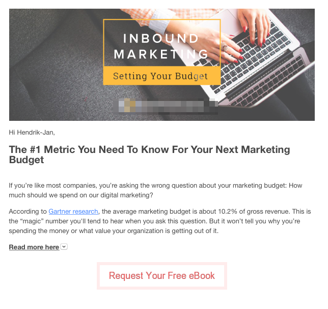
In the email above, the ‘Request Your Free eBook’ button visually dominates the page. Since the button doesn’t clarify what the ebook is about, it is logical to assume that the Ebook is about the #1 metric. But it's not.
“Request Your Free Ebook” is a great CTA. It tells me what kind of content I’m going to receive (Ebook). It tells me it’s cost (“Free”). The word “Request” implies gated content lies ahead; I knew I would have to provide my contact information so I can download the Ebook. I was fine with that—the subject line had me hooked.
So I clicked ‘Request Your Free Ebook’.
But this is where the problem comes in.
The Ebook was not “The #1 Metric You Need For Your Next Marketing Budget” I wanted. Once I saw the table of contents and scanned the first page of the Ebook, I knew for sure it wasn’t about metrics. It was about project management for website development.
Curious to what I missed, I took that email out of my trash bin. (It’s worth noting that this is more effort than I or most users would go normally through, but I was curious to know what I did wrong).
In rereading the email, I noticed a text link that said “Read more here”.
Umm…“Read more” of what? Was it going to take me to the same landing page for the Ebook I just downloaded?
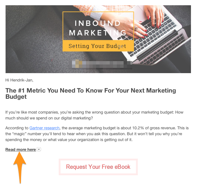
"Read more here" practically disappears into the copy. As the primary CTA, it should stand out. It should also use more descriptive language like "Read the Full Blog Post"
Reluctantly, I clicked. I expected to be taken to the same landing page.
But it didn’t. The “Read more here” link took me to a blog post that I was looking for. A blog post with the same headline as the subject line that hooked me. A blog post that was what I wanted.
I could have gotten there sooner.
Two Problems: Calls-to-Action Need Specific Language and Hierarchy
There were two fundamental problems with the calls-to-action in this email.
- The secondary CTA stood out more than the primary CTA
- The language of the primary CTA did not use language that clarified the content.
Like I said, I went through more trouble than usual to get this content. Most users won’t.
These problems illustrate two separate issues. However, I think both come down to the language used in the blog post. So let’s discuss that first.
How to make sure your calls-to-action are clickable
You can boost your click through rate, and your landing page conversion rate, by followin these CTA best practices.
CTA Language should be specific to clarify what comes next
If “Read more here…” were the only call-to-action in the blog post, it still might not be enough.
“Read more here” doesn’t make it clear what I’m going to read.
Using more enticing, specific language can increase your click through rate. Here’s how to make it happen.
- Start with a verb - “Download”, “Read”, “Watch”, “Visit”, are verbs that make it clear what will happen next. These verbs aren’t enough on their own. They need to be paired with…
- Indicate Content Type - We need to stop relying on “more” as a catch all. Replace “more” with the type of content you are promoting. “Read the blog post”. “Watch the full video”. “Download the whitepaper”. Clarifying the content type helps users set their expectations.
- Use a Power Word - “Power words” are words that add extra incentive to the user to take action. “Instant”, “Free”, and event time-periods like “30-day” are power words that are proven to generate more clicks. Here’s a list of power words that convert.
- Keep it Short and Simple - CTA’s are no place for long windedness. KISS!
Spending a little more time on your CTA will pay off in helping increase your click through rates.
CTA Placement - Make sure your primary CTA is visible
The second issue was that the secondary CTA stood out more than the primary CTA.
“Request Your Free Ebook” was in a bold button. That’s why I thought it was the relevant content offer!
But a camouflaged, generic “Read more” was what the content I actually wanted.
In this email, a “Read the Blog Post” button would have made sense in the context of the email.
As a side note, the CTA for the Ebook came out of nowhere and was unrelated to the content I expected to find in the email. You can include a secondary CTA, but give it context!
How two CTAs can work harmoniously in the same email
As a general rule of thumb when you want users to click on a specific link, the fewer distractions the better. Too many links upsets the attention ratio for the user.
But two separate CTAs can work in the same email if you do it right.
Let’s take a look back at our unbalanced example.
We’ve already established that the “Read the Blog Post” cal- to-action should have been louder.
But you don’t want two equally loud CTAs competing for attention.
If you’re going to use two CTAs - balance them.
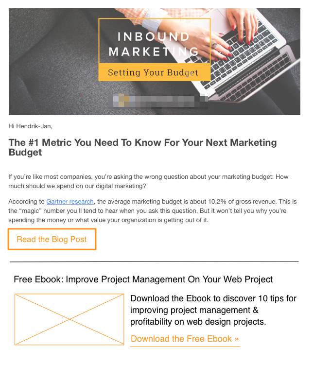
Two CTAs can live in the same email in harmony! By making the primary CTA more visually dominant, separating the secondary content, and adding context to the Ebook balances two separate CTAs in one email.
This quick revised sketch shows how you can balance two CTAs or two topics in one email.
- Use specific language - “Read the Blog Post” is a more specific CTA. What type of content? Blog post.
- Make it stand out - Using a button makes the CTA stand out more than a plain text link.
- Separate the content - Adding a rule after the primary content and primary CTA visually separates the content - indicating a change in subject.
- Add context - the headline and a short bit of content add much needed clarification on what the Ebook is.
- Downplay the secondary CTA - Choosing a text link rather than a button makes it stand out less than the primary button.
Improve CTA click through rate via A/B testing
I don’t know what the click through or conversion rate was for this email. But my guess is many users who clicked through had the same confusing experience as me.
If this company were to try this email format again to drive more traffic to the related blog post, they could A/B test the emails.
With A/B testing, it’s important to only change one element at a time. I would recommend starting by making the Blog Post Link a button. Then the second round of A/B test would be to test the button with a button with more specific language.
Remember, creating clickable calls-to-action takes time and diligence. But improving the language of your calls-to-action and the design can improve your chance of a conversion!